Rotating things with CSS3
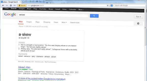
Have you ever wondered how to make things a little askew as Google has done with one of its Easter eggs on its search results page? The answers lies in CSS3.
Try using the rotate control to see a live demo or skip to the explanation. (The control uses javascript to apply the CSS transform to the selected element.)
Rotate Control
Select an element from the list and use the slider to rotate it on the page.

How it works
CSS3 includes various transform properties to manipulate the way elements appear. One of these
is rotate. To show this, let’s take an HTML snippet, for example a box like the red one above:
<div id="asdf">Try rotating me...</div>Now we need to apply the CSS:
#asdf {
  -webkit-transform: rotate(5deg);
     -moz-transform: rotate(5deg);
      -ms-transform: rotate(5deg);
       -o-transform: rotate(5deg);
          transform: rotate(5deg);

  /* for styling the box */
  background-color: lightblue;
  width: 75%;
  margin: auto;
}
You should end up with something like this:
transform: rotate(5deg);I'm rotated by 5 degrees...
The arguments for rotate() can be negative too:
transform: rotate(-10deg);I'm rotated by negative 10 degrees...
Units
The possible units are degrees deg, gradians grad, radians rad and turns turn.
360 degrees = 400 gradians = 2π radians = 1 turnBrowser Support
The example CSS includes all the prefixed forms to provide maximum browser support.
| Browser | Unprefixed versiontransform: rotate()
|
Prefixed versiontransform: rotate()
|
|---|---|---|
| Chrome: | No |
4+ -webkit
|
| Firefox: | 16+ |
3.5+ -moz
|
| IE: | 10+ |
9+ -ms
|
| Opera: | 12.10+ |
10.5+ -o
|
| Safari: | No |
3.1+ -webkit
|
| Android: | No |
2.1+ -webkit
|
Data from Can I use… and Mozilla Developer Network.
Read more
Further information about the CSS 3 transform: rotate() and other CSS 3 transforms is available from:
